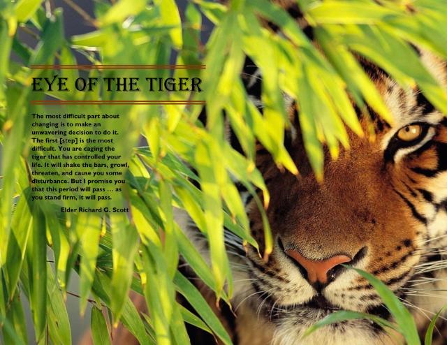
Message: It takes an unwavering conviction to repent.
Audience: Anyone who wants to repent (more likely LDS teenagers and adults)
Critiques: Shelley Guthrie Tiffany suggested moving the text up higher on the page and several others agreed. I made that change. Lacey-Ann Dennis suggested aligning Elder Scott’s name on the left. I aligned it on the right, because that is where I have always seen author’s names aligned. Alex Macfarlane suggested putting a slightly transparent box between the body copy and the picture so the text would be easier to read. I did that. Cheryl Meinen noticed the title wasn’t vertically centered. I set the Paragraph Before and After spacing to zero.
I found this photo searching Google Images. I loved the bright colors and the single eye of the tiger showing. I wanted to find a strong message to go with it. When I found this one by Elder Richard G. Scott, I knew it was the message I wanted. I feel the tiger has a double meaning. It takes a person with the “eye of the tiger” to have the conviction to change a bad habit, addiction, or sin. But I also liked how he compared that change at first to caging a tiger. This tiger is beautiful, strong, courageous, and dangerous. The strong and courageous part can beat any challenge. This was all pretty new to me. I had done different parts at different times, but had never done a typography project before. I’m a grandmother and am fairly new to this in-depth usage of a computer. So changing from a pdf to a jpeg was new. Unzipping files and figuring out how to find them and even worse how to upload or download them was a huge challenge. I had never put a transparency behind text before. Aligning was a challenge at first. It took me several hours to make the project and several more to fix what was wrong. The help from my peers was invaluable! I am pleased with the finished product.
Image Source: http://www.ahdwallpaperstab.com/wp-content/uploads/2015/01/nature_animals_tiger_wallpapers.jpg
Font Name/Category:
Title: Algerian/Decorative
Body Copy: Gill Sans MT Bold/Sans Serif


Great job! Your picture is so striking with the complementary colors. I really like your quote and find it so meaniful and beautiful! Additionally, I favor your creative choice to include the orange lines around your border. It ties in well with your photo. Great job!
LikeLike
Website: michalawawro.wordpress.com
LikeLike
This project reminds me of a poem:
An old Cherokee is teaching his grandson about life. “A fight is going on inside me,” he said to the boy.
“It is a terrible fight and it is between two wolves. One is evil – he is anger, envy, sorrow, regret, greed, arrogance, self-pity, guilt, resentment, inferiority, lies, false pride, superiority, and ego.” He continued, “The other is good – he is joy, peace, love, hope, serenity, humility, kindness, benevolence, empathy, generosity, truth, compassion, and faith. The same fight is going on inside you – and inside every other person, too.”
The grandson thought about it for a minute and then asked his grandfather, “Which wolf will win?”
The old Cherokee simply replied, “The one you feed.”
I also like the font that you chose – it is clear, but a little hard to read because of the size. The title as a nice pop to it. For the image it almost looks 3D it nose comes right out at you and the eye looks to attack something. Also love that is very bright in color. Nice work!
Please take a look at my design: https://duhacekblog.wordpress.com/2016/01/26/hooah/
LikeLike
You did an amazing job on your project! It looked like all your hard work paid off! I think this quote suits your situation perfectly! Technology can be a challenge, but people have to want to change to learn, and implement it in their lives. The picture is striking, with beautiful vibrant colors! The quote is also very meaningful, and whenever the reader see’s or thinks of a tiger, they can easily be reminded of your quote!
Sabrina’s blog can be found at: https://sabrinaspeer.wordpress.com/
LikeLike
I love the picture you chose, and overall your blog is very pleasant and comfortable to be. Your gestalt project was especially impressive. I’m embarrassed to share my own. It is a far cry from the creativity it took to make yours. You are a very talented designer.
https://julesherbertblog.wordpress.com/
LikeLike
Nancy your design turned out beautiful. I love the image you chose and the quote from Elder Scott is perfection. I enlarged the image on my computer to paper size (s it is designed for) and it made it much easier to read and it looks great. Great work!
Please take a look at mine: https://staceyrosin.wordpress.com (Dace)
LikeLike
Nancy, I like your finished project also. The orange lines tie to the tiger, very creative. The colors in your image are very vibrant. Your quote and image weld together very nicely.
Check out my final project at:
LikeLike